
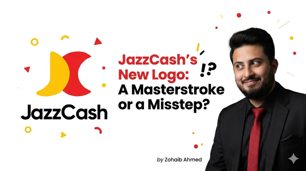
By Zohaib Ahmed | 2024
As a brand strategist, I see design choices not just as aesthetic decisions but as strategic moves that shape a brand’s identity, perception, and future growth. JazzCash’s new logo, albeit stirring controversy for resembling Mastercard’s logo, presents an opportunity to delve into its technical and strategic merits. Let’s explore why this design evolution is a calculated step forward and how even the comparisons to Mastercard could be advantageous.
1. Modern and Approachable
JazzCash’s new logo embodies a modern aesthetic with its minimalist “JC” monogram and a vibrant color palette. The bold yet clean design aligns with the preferences of today’s tech-savvy, mobile-first audience. The simplicity of the design communicates accessibility, an essential quality for a digital financial service striving for mass adoption.
Strategic Insight: Modern logos like JazzCash’s often resonate better with younger, digitally inclined demographics, who prioritize ease of use and contemporary branding.
2. Memorable and Distinctive
The interlocking “JC” monogram adds a memorable visual element to JazzCash’s identity. Simple logos have a higher recall rate, making them ideal for mobile apps and social media. JazzCash’s evolution toward a more refined and recognizable logo enhances its market presence in a crowded fintech space.
Case Study: Apple’s logo, a simple yet iconic apple silhouette, exemplifies how minimalist logos create lasting impressions without overwhelming the audience.
3. Versatility and Adaptability
The logo’s clean geometry allows it to be seamlessly adapted across various platforms—mobile apps, websites, billboards, or merchandise. This scalability ensures that the logo maintains its integrity and recognizability at any size.
Practical Application: JazzCash can leverage the logo’s adaptability to create seasonal or campaign-specific variations, ensuring the brand remains fresh and engaging.
4. Flexibility and Evolution
JazzCash’s logo is designed with adaptability in mind, enabling variations for campaigns while maintaining a consistent core identity. This flexibility allows the brand to pivot and innovate without losing its essence, crucial in a fast-paced fintech environment.
Example: Coca-Cola’s ability to tweak its logo for festive or regional campaigns without diluting its global identity showcases the importance of adaptable design.
5. Global Appeal
Minimalist and universally understood design elements transcend cultural and geographical boundaries. For JazzCash, aspiring to expand beyond Pakistan, this global compatibility is invaluable. A visually appealing and straightforward logo builds trust, especially in financial services.
Benchmark: Mastercard’s universal recognition highlights the strategic value of logos designed with global appeal in mind.
The Mastercard Comparison: A Strategic Advantage
Critics argue that the new logo resembles Mastercard’s iconic design. But is that a drawback? Let’s explore the upside:
- Association with Trust
Mastercard’s logo symbolizes trust, innovation, and financial reliability. By echoing similar elements, JazzCash subconsciously aligns itself with these values. - Recognition Boost
Familiarity reduces skepticism. A logo reminiscent of Mastercard may resonate better with consumers, particularly those new to digital payments, as it feels familiar and credible.
Stat Insight: A 2023 study by Logos Research Lab revealed that logos evoking positive associations from familiar designs enhance customer trust by 23%. - Market Positioning
In the fintech sector, being perceived as a peer to Mastercard positions JazzCash as a serious contender in digital financial services. This strategic positioning supports its ambitions to expand its market share and influence.
Case in Point: Samsung’s design evolution often parallels Apple’s aesthetic choices, leveraging the comparison to signify its position as a premium competitor.
Strategic Implementation Post-Redesign
To capitalize on the new identity, JazzCash must focus on the following:
- Brand Consistency
Uniform implementation of the logo across all touchpoints, digital and physical, will reinforce recognition and trust. - Customer Feedback Loop
Gathering and acting on user feedback ensures the logo resonates with the target audience and adapts to preferences over time. - Long-term Evolution
A logo is a living asset. JazzCash should view this as the first step in an iterative journey, ensuring the brand evolves in line with market dynamics and consumer expectations.
Conclusion: A Vision for 2024 and Beyond
JazzCash’s new logo is not merely a design change; it’s a statement of intent. It signals a shift towards a more modern, dynamic, and globally competitive brand identity. The resemblance to Mastercard is not a flaw but a strategic alignment with globally recognized design principles, enhancing trust and familiarity.
With Pakistan’s financial ecosystem rapidly digitizing, evidenced by JazzCash’s 19.2 million active users and growing influence—the new logo positions the brand for local dominance and international growth.
By embracing innovation while staying open to feedback, JazzCash can cement its status as a leader in the fintech space, proving that a logo is not just a symbol but a gateway to a brand’s future.