
By Zohaib Ahmed
Hey there, fellow design enthusiasts!
Remember those sleek, minimalist logos that dominated the design scene a while back? You know, the ones that could fit on a tiny smartwatch screen without breaking a sweat? Well, buckle up, because things are getting… interesting.
We’re witnessing a fascinating shift: the rise of the unreadable logo.
Now, before you grab your pitchforks, hear me out. This isn’t about deliberately making your brand impossible to decipher. It’s about a playful rebellion against the tyranny of minimalism, a return to complexity and a celebration of the unexpected.
Exhibit A: Katarzyna Konieczka
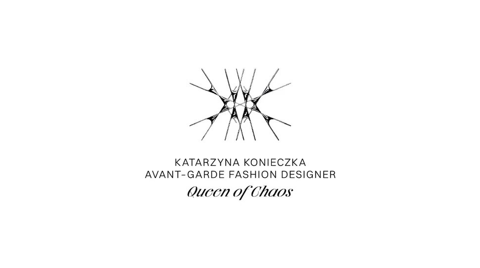
This Polish fashion designer, aptly nicknamed the “Queen of Chaos,” unveiled a logo that could give a black metal band a run for its money. Think thorns, barbed wire, and a general air of “don’t mess with me.” It’s perfectly on brand, reflecting her dramatic, theatrical aesthetic.
Exhibit B: The Return of Maximalism
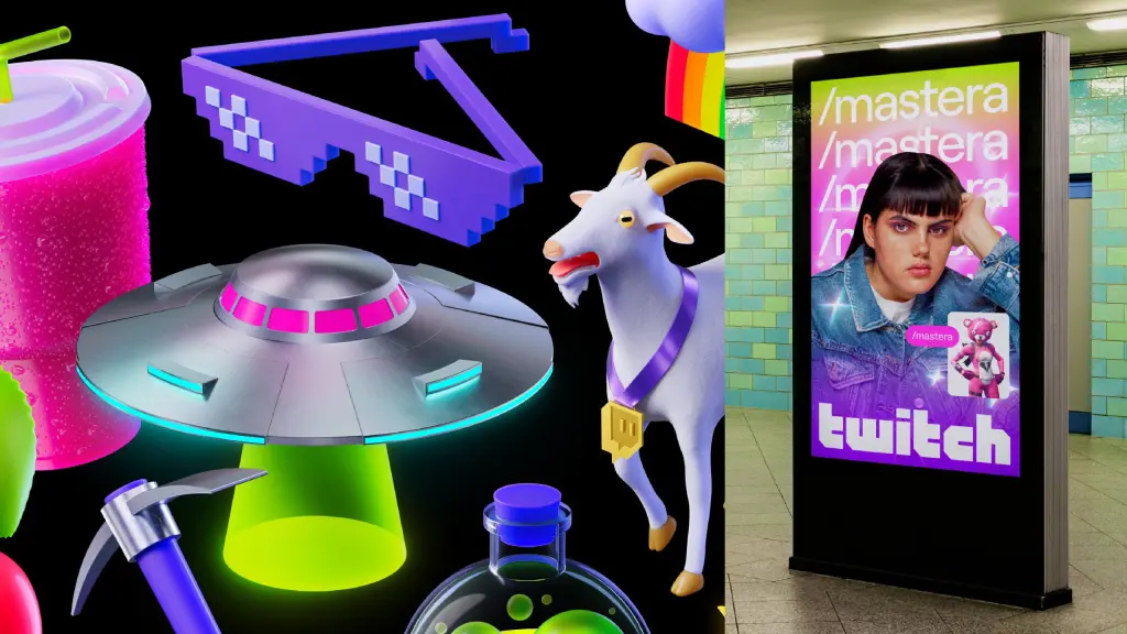
Remember when luxury fashion logos were all starting to look like identical twins? Well, that era is officially over. We’re seeing a resurgence of maximalist typography, grungy aesthetics, and logos that dare to be different.
- Puig: Embracing the infinite line, inspired by the iconic artist Joan Miró.
- Loewe and On: A daring (some might say confusing) logo mashup.
Why the Shift?
Several factors are fueling this logo revolution:
- High-resolution screens: No more pixelation! We can now afford to be bolder and more intricate.
- The backlash against minimalism: After years of sleekness, designers are craving something… more.
- Nostalgia for the past: Think early web design, Y2K aesthetics – a yearning for the messy, imperfect beauty of the pre-minimalist era.
But is it really a trend?
Probably not in the traditional sense. This isn’t about jumping on a bandwagon. It’s about finding the right balance for your specific brand.
- If you’re a high-fashion brand pushing boundaries, go wild! Embrace the chaos, experiment with unconventional typography, and let your logo reflect your unique identity.
- If you’re a local bakery, maybe stick to something a bit more… readable.
The Takeaway
The world of logo design is constantly evolving. This shift towards complexity is a reminder that there’s no one-size-fits-all solution.
So, what do you think? Are you embracing the unreadable logo trend? Or are you sticking to the tried-and-true principles of clarity and simplicity?
Let’s discuss in the comments below!